
The Nagaland Health Project Hospital Information System Dashboard (NHPHIS Dashboard) is a web- based platform that provides real-time data and insights on the performance of health facilities (District hospitals) in Nagaland. It is part of the Nagaland Health Project (NHP), a World Bank- supported initiative to improve the management and delivery of health services in the state.
The NHPHIS Dashboard provides a variety of data and reports on key health indicators, such as:
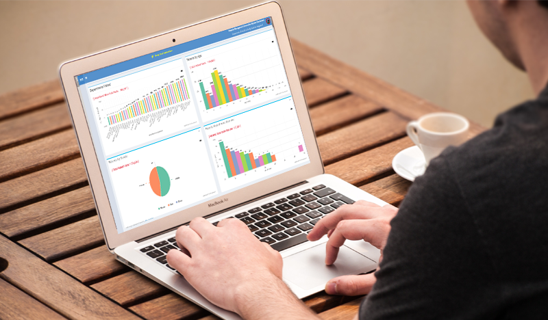
The dashboard is designed to be used by a variety of stakeholders, including health facility managers,district and state health officials, and policymakers. It can be used to identify areas where improvement is needed, track progress over time, and make informed decisions about resource allocation and service delivery.
Here are some specific details about the NHPHIS Dashboard:
The NHPHIS Dashboard is a valuable tool for improving the efficiency and effectiveness of health services in Nagaland. By providing real-time data and insights on health facility performance, the dashboard can help stakeholders to identify and address areas of need, track progress over time, and make informed decisions about resource allocation and service delivery.
The NHP-BMW (Bio-Medical Waste Management System) dashboard is a web-based tool that provides real-time data and insights on the performance of biomedical waste management application is being used in Nagaland. It is designed to help decision-makers at all levels of the health system to identify and address areas for improvement.
The dashboard includes a variety of features and functionality, including:
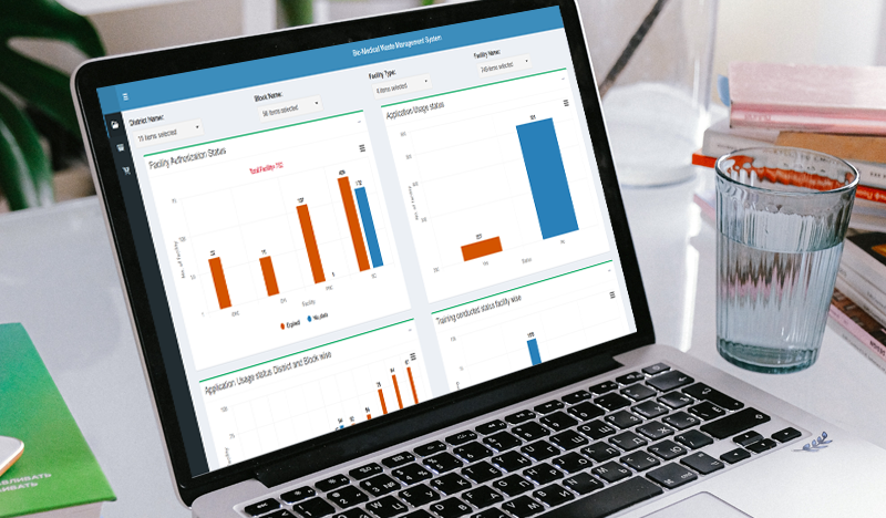
The NHP-BMW Dashboard is a valuable tool for improving the efficiency and effectiveness of biomedical waste management in Nagaland. It is used by a wide range of stakeholders, including health facility managers, district health officers, state health officials, and policymakers.
Here are some specific examples of how the NHP-BMW Dashboard is being used to improve biomedical waste management in Nagaland:
Mantra Application Dashboard is a Shiny based analytics platform that provides near real-time insights on a wide range of maternal and newborn health indicators across the health facilities in Uttar Pradesh. The dashboard is appended to Mantra Application which digitally captures labour room register details of a pregnancy case in the facility to improve the monitoring and service quality in antenatal and postnatal care.
The dashboard provides insights on over 150 MNCH indicators under the following categories:
The dashboard leverages on state-of-the-art technologies including R, Python and Arrow file system for fast computation and scalability. The major features of the dashboard include:
The system currently captures and processes over 3.5 million deliveries and related indicators over the entire state of Uttar Pradesh. It is utilized by users at different levels ranging from Subcentres, PHCs, CHCs, District hospitals, Medical Colleges, Health Ministry and UNICEF for a variety of tasks including monitoring, performance evaluation and report generation.
Community-Based Organizations (CBOs) dedicated to driving positive change and empowerment. The Bihar Rural Livelihoods Promotion Society (BRLPS) understands the need for a data-driven system. To further monitor and support these organizations, we are thrilled to work with BRLPS to develop our newly Comprehensive Centralized CBO Dashboard, a powerful tool that offers invaluable insights into the cbo health, membership, financial activities, farming activities, and much more of CBOs. This dynamic reporting tool offers insights at the state, district, block, panchayat, and village levels, aiding in the evaluation and enhancement of various programs and initiatives. We have analyzed key components of the BRLPS Applications Dashboard and the Comprehensive HR Indicators integrated into the system, highlighting how they facilitate informed decisions and workforce management. Here we are dealing with more than 25 million data and helping 38 Districts and 534 blocks in their decision-making.

We assess the financial well-being of Self-Help Groups (SHGs) by examining their savings and loan accounts, including different loan types, amount repayment, amount outstanding, capitalization timelines, and other critical financial data. Our in-depth analysis covers the Bank Sakhi program, focusing on various aspects such as transactions, agent commissions, deposits, withdrawals, and the performance of active and inactive agents. We aim to empower SHGs and Village Organizations (VOs) and integrate them into the agricultural ecosystem to promote knowledge sharing, financial inclusion, and community-driven initiatives. Our collaboration includes agricultural analysis, encompassing both hybrid and local seed varieties, crop assessments specific to the growing season, and the promotion of Zaid crops in addition to traditional ones to optimize agricultural yields and income.
We conduct performance assessments of Cluster Level Federations (CLFs) and provide project-wise grading reports to gauge their effectiveness in enhancing livelihoods. We also meticulously track the distribution of goats and poultry to SHGs on a year and month-wise basis. Our district-wise analysis considers mortality among member beneficiaries and evaluates the insurance coverage for these members. Furthermore, we aim to harness the potential of Neera, a unique beverage, to empower rural communities. We employ various analytical components to gain insights into daily pH value analysis, daily BRIX value analysis, forecasting, collection procedures by tappers, asset acquisitions, and performance evaluations at both the district and block levels.
The BRLPS Dashboard provides a variety of data and reports on key indicators, such as:
Key Features of the Comprehensive Community-Based Organizations (CBO) Dashboard:
Dashboard Structure: The Comprehensive CBO Dashboard is meticulously designed with a user-friendly interface, organized into modular components. It leverages robust technical platforms such as RShiny, Power BI, and Python for efficient data processing and presentation. Each module is thoughtfully structured to focus on specific aspects of CBOs and their operations. These modules encompass vital areas, including CBO formation, membership management, financial transactions, cadre presence, and more, offering a comprehensive and systematic view of CBO performance and community development efforts.
Data Sources: For a truly comprehensive understanding, our dashboard seamlessly integrates data from diverse sources, including Oracle, MS SQL, and others. This integration provides a 360-degree perspective on community engagement and development.
Data Visualization: The Comprehensive CBO Dashboard harnesses the power of data visualization tools, utilizing libraries like HighCharts, Matplotlib, Plotly, and D3.js for complex data representation. Expect to see interactive charts, graphs, maps, and other visual aids that simplify data interpretation. These visualizations can be embedded seamlessly into the Power BI platform, enhancing accessibility and enabling stakeholders to quickly identify trends and areas in need of attention.
Reporting Functionality: Users are empowered with the capability to generate custom reports on a wide array of indicators and metrics. These reports can be exported in various formats, such as PDF or Excel, and may be scheduled using R and Python scripting to ensure timely updates. Whether you're interested in the financial health of Self-Help Groups, the presence of cadre in CBOs, or the progress of flagship programs, you can customize your reports to align with your specific community development initiatives.
This structured, user-centric approach positions the Comprehensive CBO Dashboard as a dynamic platform that leverages the technical prowess of RShiny, Power BI, Python, Oracle, MS SQL, and others. It fosters informed decision-making, strengthens community empowerment, and cultivates sustainable growth by harnessing the full potential of data.
UP Climate Change Authority Dashboard, a dynamic dashboard offering valuable insights into air quality indicators, is a comprehensive dashboard divided into three main tabs—Air Quality Overview, Air Quality Live, and Air Quality Historical—that provides real-time and historical data visualization, including a GIS-based map, to enhance our understanding of air quality conditions. Powered by R Shiny and utilizing feather data through CPCB-provided APIs, the dashboard covers essential metrics such as the Air Quality Index, station uptime, PM2.5, PM10, NO2, SO2, O3, CO, temperature, relative humidity, and wind speed, all within the last 24 hours.
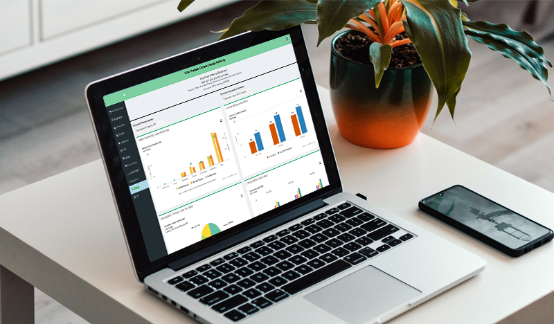
This dashboard leverages CPCB authorized APIs to deliver state-specific data for the provided data points and air quality indicators. It supports comprehensive decision-making for policies aimed at combating air pollution and monitoring the situation within Uttar Pradesh state.
The dashboard's design features modularity, encapsulating each component within separate R Shiny modules for enhanced reusability and maintainability. Dynamic updates driven by reactive expressions cater to user interactions, caching and error handling mechanisms ensures the dashboard's continued functionality even when CPCB APIs are unavailable, The dashboard demonstrates technical depth in the following areas: